
Monday, October 11, 2010
Van Dyke Project #2 Image

Van Dyke Project #1
 Here's that old barn again. I thought it would be interesting to see it as a Van Dyke process. (Yes, I know, I could use some new images. Haven't found the time yet for shooting... images, that is. ;-o)
Sunday, September 26, 2010
"Madonna and Child"
 I just had to show this one a bit larger. The actual sculpture is on a pedestal, at the Boston MFA. It's from the 12th century, by an unknown artist of Lombardi, Italy. It is so striking to me that a solid mass of stone (limestone and some other material) can show such emotion--there is so much tenderness expressed in the faces, tilt of the heads, and embracing of the arms. It almost begs you to come in for "a group hug". :-) It's just a lovely piece of art.
"Madonna and Child" Cyanotype
 This image was particularly difficult, since the original photo I took was of this (beautiful) 12th century sculpture, in low light, without a flash--just a dim spotlight was on the statue, and I didn't even know if I'd captured it. As you may see, it has high contrast, and though the faces are fairly sharp, the lower portion is out of focus.
I'm trying another with 2 negs right now. We shall see what happens.
Saturday, September 25, 2010
Cyanotype Project

I was very excited to use this image because it was taken a few years ago, and never developed as a print before. I LOVE the convenience (and the look and "feel") of the cyanotype process. I think it lends itself very well to this particular image--like this old barn, it's a bit ghostly and of another era. I like to think of what took place there long ago.
Saturday, September 11, 2010
Barbie Gratefool (and that's no typo)

I just came across a Katy Perry video. She's a very funny performer. Check out one of her music videos, using Barbie and Ken dolls. Katy is also dressed and made up to look like a doll. Funny stuff.
http://www.bing.com/videos/watch/video/ur-so-gay-by-katy-perry/56wv3fc?rel=msn
Cliche Verre (the last of three)
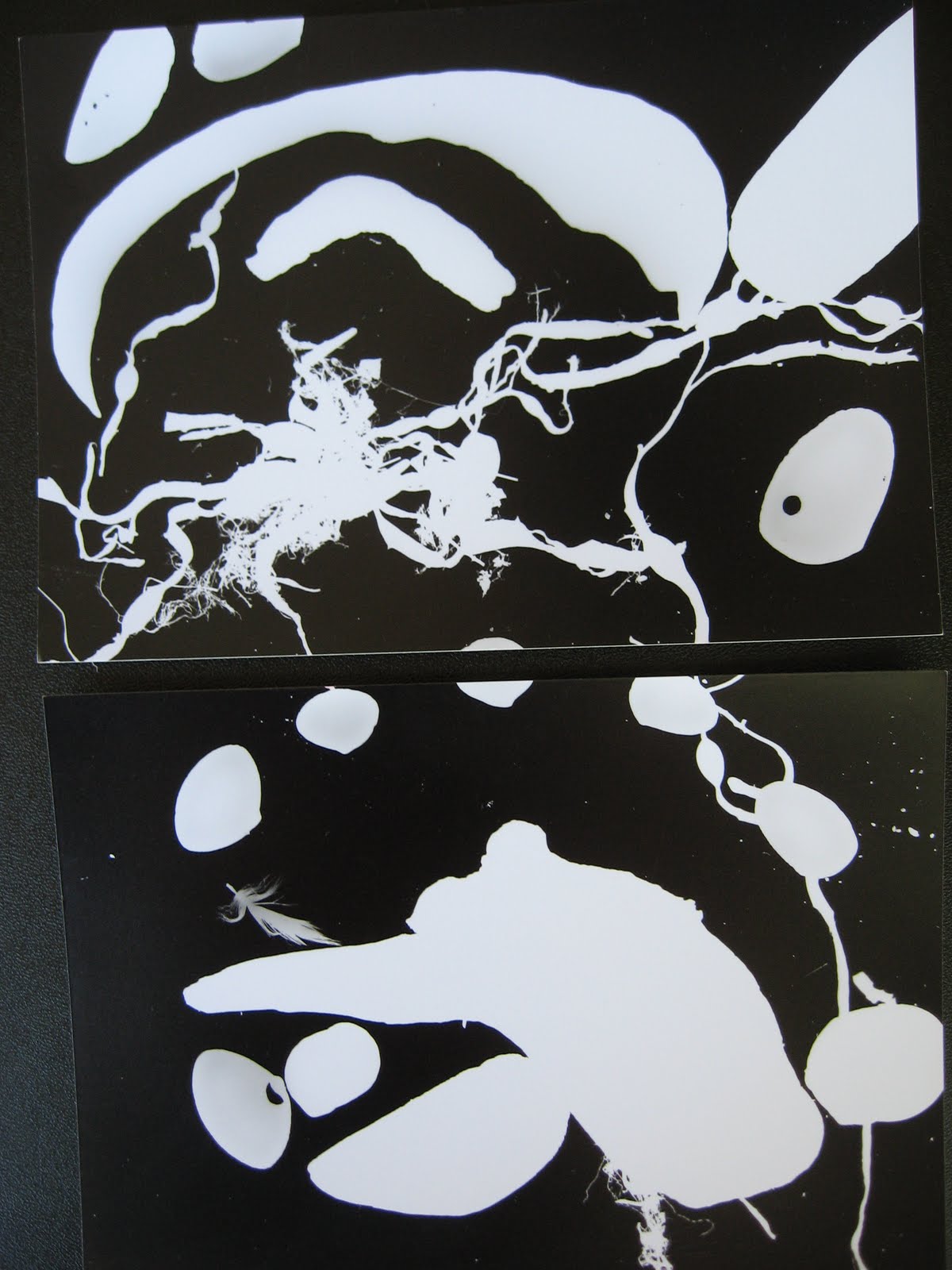
Here's an abstract type, using seashells, seaweed, and little pieces of driftwood. What can I say? I like the beach stuff, even when light can't get through it.
Subscribe to:
Posts (Atom)